

============ PART A: PRODUCT DATA INPUT (EDIT THIS ONLY) ============

[PRODUCT_URL: tempel link produk, or none]
[LOGO: attached store logo, or none]
[LAYOUT_VARIANT: pilih satu: 1 / 2 / 3 / 4 / 5 / 6]
[UI_OVERLAY: none / minimal / full]
[WEBSITE: alamat website, or none]
[VERSION_CHIP: teks pendek, contoh: Official Store, or none]

Fields below are OPTIONAL. If filled, use them exactly. If left empty, fill them from PRODUCT_URL:
[SERIES_NAME: nama seri, maksimal 3 kata, contoh: Model X]
[KEYWORD: satu kata raksasa, contoh: PRO]
[ACCENT_LINE: maksimal 6 kata]
[SHORT_DESCRIPTION: maksimal 12 kata, or none]
[SPEC_1: maksimal 4 kata] [SPEC_2: ...] [SPEC_3: ...]  (maksimal 5 spesifikasi, only for layout 4, or none)

LAYOUT_VARIANT options:
1 = Model holds the product in front of the body toward the camera, a big soft glowing ring behind the model, headline at the upper left.
2 = Clean white studio, model with the product held beside the face, headline at the lower left on the empty side.
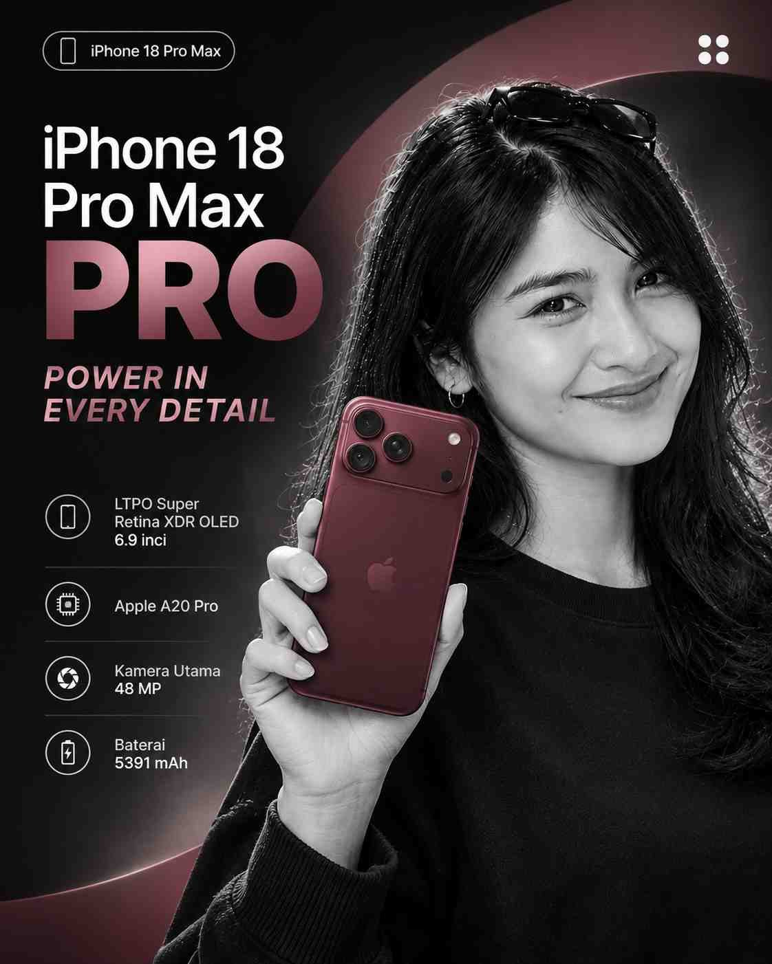
3 = Dark background, the model in black and white (grayscale) with ONLY the product in full color, one thick curved colored arc behind the model, headline at the left.
4 = Model with an outfit in the product's color tone, product held toward the camera, a short spec list with tiny icons on the left, headline at the top left.
5 = Low-angle shot, one arm reaching toward the camera holding the product, dark studio, headline at the left.
6 = Extreme close-up of one hand holding the product very large, headline at the bottom center.

UI_OVERLAY options:
none = no interface elements at all.
minimal = only the bottom glass bar (VERSION_CHIP at left, WEBSITE pill at right, up to 4 simple abstract icons in the middle).
full = the bottom glass bar plus one vertical glass capsule with 4 simple abstract icons on one side and one small music-player-style glass widget (icons only, no text), both decorative.

DATA EXTRACTION RULES:
1. If PRODUCT_URL is given, open and read the page first.
2. Extract only what is written on the page: series name, product name, and up to 5 specs. Never guess or invent specs, prices, or claims.
3. Do not show prices. Write ACCENT_LINE in at most 6 words and SHORT_DESCRIPTION in at most 12 words, based only on the page.
4. Before creating the image, show me the extracted text as a short list and wait for my "OK". If the page cannot be read, tell me and ask me to type the data manually.

============ PART B: DESIGN STYLE (DO NOT CHANGE) ============

TASK: Design one premium monochrome tech-product advertisement poster, portrait ratio 4:5. One hero product, one dominant color. Hierarchy: product first, KEYWORD second, accent line third, details last.

STEP 0 (do this first): If no product photo is attached, stop and ask me to attach one. Do not invent a product.

PRODUCT LOCK: Treat the attached photo as locked reference. Keep the exact shape, proportions, color, camera layout, buttons, and any marking or logo on the device exactly as in the photo. Do not redraw, redesign, or add features. Do not draw any new logos. Only lighting, angle, and placement may change. If a screen is visible, keep it; otherwise show a clean abstract wallpaper without any text.

COLOR SYSTEM (monochrome, strict):
- Take the product's dominant color as the single base hue. Build the whole poster from shades of that one hue (light, mid, deep), plus white, black, and cream. Do not add any other hue.
- Backgrounds: a smooth gradient of that hue with a soft glowing ring or one thick curved arc in the same hue (layouts 1, 3, 4), a clean white studio with soft shadows (layouts 2, 6 if white), or a deep near-black studio (layouts 3, 5).
- The model's clothing follows the same hue family or neutral black, white, or cream.
- Accent text (ACCENT_LINE) uses the base hue on light or dark backgrounds with enough contrast; if contrast is low, use white.

TYPOGRAPHY:
- One clean modern sans-serif family, two weights: SERIES_NAME in a light, small weight; KEYWORD in a very bold, huge weight directly below it, in white or near-black with strong contrast.
- ACCENT_LINE: medium weight, in the accent color. SHORT_DESCRIPTION: small, light, two lines maximum.
- Left-aligned text block, margins at least 5%. The product or model may overlap a small part of KEYWORD, but every letter must stay readable.

HERO SUBJECT: follow LAYOUT_VARIANT. Photorealistic fashion and product photography: sharp focus on the product, one main cinematic light, soft rim light, believable reflections and shadows. If a person appears: natural skin texture with visible pores, natural hands with five fingers and correct proportions, relaxed styled pose, clean modern outfit, natural hair, no plastic skin, no uncanny eyes, no resemblance to any real celebrity. The face may be partly cropped by the frame edge.

TOP BAR: a small rounded chip with a simple abstract mark and SERIES_NAME at the top-left, LOGO small at the top-right. Skip anything set to "none". Do not create a fake brand logo.

UI OVERLAY: follow UI_OVERLAY. Glass elements are semi-transparent, softly blurred, with thin white outlines and rounded corners, small and elegant. Use ONLY simple abstract line icons (circle, plus, grid, play). Do NOT recreate real app icons, real brand logos, or any operating-system interface. No readable text inside the widgets except VERSION_CHIP and WEBSITE.

SPEC LIST (layout 4 only): up to 5 short lines, each with a tiny line icon, in small clean text with generous spacing. Skip if all are "none".

COMPOSITION: generous negative space, a strong focal point on the product, nothing important crossing the frame edge except the intentionally cropped face or body. Keep the product larger than the text.

TEXT RULES: use ONLY the text I provide or approve. Spell every word and number exactly as given. Do not add slogans, prices, extra specs, floating decorative words, fake brand names, or pseudo-text. If text cannot be rendered correctly, make it smaller rather than invent letters.

QUALITY CHECK before finalizing: (1) the product is identical to the photo, (2) every word and number is spelled exactly as provided, (3) KEYWORD and ACCENT_LINE are readable with strong contrast, (4) the whole poster uses only the base hue family plus white, black, and cream, (5) one hero product and no extra objects, (6) hands and faces look natural, (7) no real app icons or logos in the UI elements. If any check fails, fix it and regenerate.

AVOID: AI-slop look, changed product, invented logos, invented specs, garbled text, tiny unreadable labels, plastic skin, extra fingers, multiple products, clutter, rainbow gradients, glow overload, lens flares, fake HDR, watermark, repeated elements, real app icons, low contrast, cartoon or 3D-render look.
Salin prompt di atas.
Buka ChatGPT. Kalau punya foto produk atau foto model, lampirkan dulu.
Ganti bagian yang berwarna kuning dengan data usahamu, lalu kirim.
Pilih rasio 3:4 saat membuat gambar agar hasilnya sesuai.