

============ PART A: INPUT (EDIT THIS ONLY) ============

[RATIO: 3:4 / 4:5 / 2:3 / 9:16 / 1:1]
[LAYOUT_VARIANT: pilih satu: 1 / 2 / 3]
[PRINT_STYLE: vintage travel poster screenprint / risograph two-color / retro lithograph / mid-century flat poster]
[PALETTE: maksimal 5 warna, contoh: cobalt blue, cream gold, deep green, grass green, white / burnt orange and teal / sepia and cream / pink and navy]
[GRAIN_LEVEL: heavy / medium / light]
[HUMAN_FIGURE: one small distant figure for scale / none]
[PLACE_NAME: nama tempat sebagai teks, maksimal 3 kata, contoh: nama landmark atau kota, or none]
[SCRIPT_WORD: satu kata atau frasa script, maksimal 3 kata, contoh: Landmark Print, or none]
[BOLD_WORD: satu kata tebal huruf kapital, maksimal 10 huruf, contoh: PRINT, or none]
[TEXT_COLOR: cyan glow / white / cream / dark navy]
[INSET_ORIGINAL: no / yes]
[TEXT_POSITION: bottom over the water or ground / top over the sky]

PHOTO TO ATTACH: SOURCE_PHOTO (one clear, sharp, high-resolution photo of a landmark, building, or scenic place, preferably a front or three-quarter view with the whole subject visible and a clear foreground). I confirm that it is a photo I took, or that I have permission to use it.

DATA RULES:
1. Use ONLY the text I provide. Add no names, signatures, logos, watermarks, dates, or slogans, and do not add any other text or fake sign inside the scene. If a field is "none", leave that element out completely.
2. Do NOT identify any real person in the photo. If real people appear, simplify them into tiny anonymous silhouettes or omit them according to HUMAN_FIGURE.
3. Before creating the image, tell me in two short lines what you understood (style, palette, text) and wait for my "OK".

LAYOUT_VARIANT options:
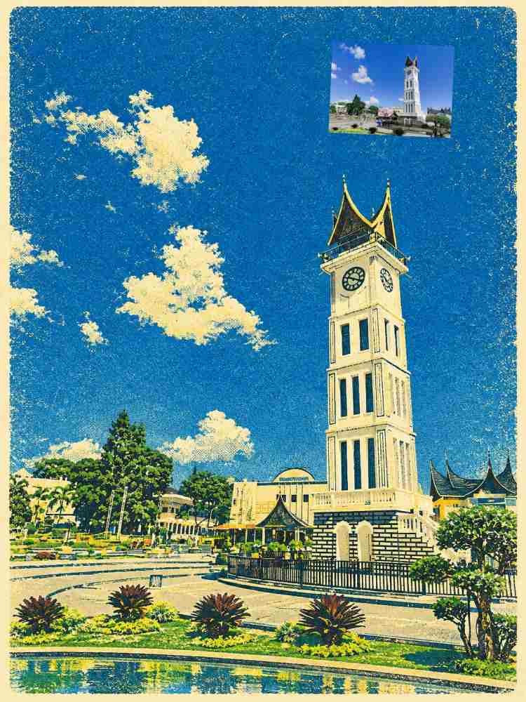
1 = Reference style: the landmark large and centered, a flat saturated sky above, a foreground reflecting pool or path leading into the scene, the text in two levels at the bottom, and an optional small original photo at the upper left if INSET_ORIGINAL is "yes".
2 = Frame: the same illustration inside a cream paper border with rounded corners, the title text on the paper margin below it.
3 = Poster minimal: the landmark smaller and centered with a lot of empty sky above, the text centered at the top, no foreground details beyond a simple ground line.

============ PART B: STYLE (DO NOT CHANGE) ============

TASK: Turn SOURCE_PHOTO into one vintage-print travel poster illustration, ratio RATIO. One landmark, one flat sky, a limited palette, and a tactile printed texture. The result must look like a real vintage screenprint or risograph poster, not like a photo filter and not like a modern flat vector.

STEP 0 (do this first): If no photo is attached, stop and ask me to attach one. Do not invent a landmark.

SUBJECT LOCK (most important):
- Keep the real architecture and layout exactly as in SOURCE_PHOTO: the proportions, the number and shape of towers, domes, windows, arches, columns, steps, and the surrounding trees, water, and paths. Do not add, remove, simplify beyond printing style, or "improve" any structural element. Do not merge or invent buildings, do not change the landmark's identity, and do not add fictional decorations.
- If the photo contains a recognizable sign, name, or text, remove or blur it; do not reproduce any real text or logos.
- If real people appear, show them only as tiny anonymous flat silhouettes (or leave them out); never depict recognizable faces.

PRINT LOOK (the key):
- Use ONLY the colors in PALETTE, as flat, overprinted ink layers with slight misregistration at some edges, no gradients beyond printed tonal overlays, and tonal shading created by halftone dots, hatching lines, or stippled texture.
- Sky: a single flat saturated color field with grainy ink texture and small speckles; no clouds unless they appear as simple flat shapes.
- The landmark: the lit surfaces in a warm light tone from the palette, the shaded surfaces in a darker tone from the same palette, with the architectural details (arches, carvings, windows, ornaments) simplified into clean cut shapes that are still recognizably the same as in the photo.
- Foreground: reflections rendered as simple wavy bands of the palette colors with a mirrored, slightly distorted copy of the building; trees as clustered dark shapes with a little light highlight; paths in the light tone.
- GRAIN_LEVEL controls the paper and ink grain, scratches, and speckled wear, evenly across the whole poster (no dirt that hides details). PRINT_STYLE sets the feeling: "screenprint" = bold flat shapes, "risograph" = two or three spot colors with a visible grain, "lithograph" = softer tonal blends with fine grain, "mid-century flat" = geometric simplified shapes.
- HUMAN_FIGURE "one small distant figure for scale" = one tiny, simple, anonymous silhouette on the path; "none" = no figures.

INSET (only if INSET_ORIGINAL is "yes"): show SOURCE_PHOTO unchanged (no editing) in a small rounded frame with a thick white border at the upper left, with a thin curved arrow in the text color pointing toward the illustration. No text near it.

TYPOGRAPHY (only if text is provided): SCRIPT_WORD in a bold, flowing retro brush-script lettering in TEXT_COLOR, with a soft glow if the color is "cyan glow"; BOLD_WORD directly below it in a heavy, clean, uppercase geometric sans-serif in white; PLACE_NAME (if given) in small spaced capitals below. Placed according to TEXT_POSITION over the calmest area; never over the landmark's key details. Strong contrast, spelled exactly as given. No other text.

COLOR SYSTEM (restraint is mandatory): only the colors in PALETTE plus the TEXT_COLOR. No extra hues, no photographic color, no neon beyond the text glow.

COMPOSITION: symmetric or well-balanced, the landmark as the clear focus, leading lines from the foreground toward it, margins at least 3% on every side, nothing important cropped by the frame edge. Follow RATIO.

TEXT RULES: use ONLY the text I provide. Do not add slogans, captions, dates, signatures, watermarks, or pseudo-text. If text cannot be rendered correctly, make it smaller rather than invent letters.

QUALITY CHECK before finalizing: (1) the landmark's structure matches the photo (number and shape of towers, domes, arches, windows), (2) only the palette colors are used, in flat, printed layers, (3) the grain and print texture look real and even, (4) reflections and trees are simple and consistent, (5) no real faces or recognizable people, no fake signs or logos, (6) the text is spelled exactly and readable, (7) the inset (if any) is the unchanged original. If any check fails, fix it and regenerate.

AVOID: a photographic or 3D-render look, smooth digital gradients, a modern flat vector look without texture, changing or inventing architecture, extra towers or domes, fake signs or logos, readable real text from the photo, recognizable faces, too many colors, neon glow outside the text, heavy dirt that hides details, watermark, garbled text.
Salin prompt di atas.
Buka ChatGPT. Kalau punya foto produk atau foto model, lampirkan dulu.
Ganti bagian yang berwarna kuning dengan data usahamu, lalu kirim.
Pilih rasio 210:297 saat membuat gambar agar hasilnya sesuai.