


============ PART A: PRODUCT DATA INPUT (EDIT THIS ONLY) ============

[PRODUCT_URL: tempel link produk, or none]
[RATIO: 1:1 / 4:5]
[LAYOUT_VARIANT: pilih satu: 1 / 2 / 3 / 4 / 5 / 6]
[BASE_COLOR: warna dasar, contoh: soft pink, peach, mint, lavender]
[PROP: satu properti pendukung, contoh: cherry blossom branch, white stone with leaves, clear liquid splash, checkered floor, or none]
[LOGO: attached brand logo, or none]
[SIZE_LABEL: contoh: 30 ml, or none]

Fields below are OPTIONAL. If filled, use them exactly. If left empty, fill them from PRODUCT_URL:
[HEADLINE: maksimal 4 kata, huruf kapital]
[HIGHLIGHT_WORD: satu kata dari headline yang diberi warna aksen]
[SUBTITLE: maksimal 6 kata, or none]
[BENEFIT_1: maksimal 3 kata] [BENEFIT_2: ...] [BENEFIT_3: ...]  (or none)
[STEP_1: maksimal 5 kata] [STEP_2: ...] [STEP_3: ...]  (hanya untuk layout 4, or none)

PHOTOS TO ATTACH: PRODUCT_1 (hero bottle), and optionally a second angle.

LAYOUT_VARIANT options:
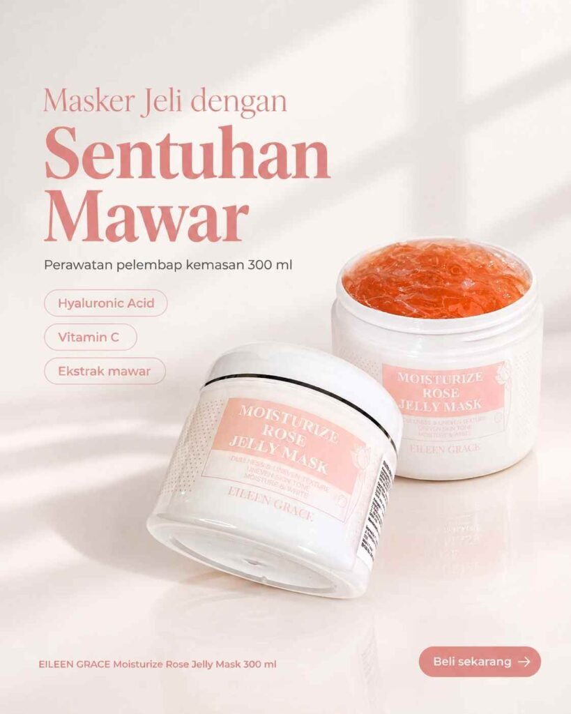
1 = Product centered on a pink-and-white checkered floor in a soft pink room, headline at the top.
2 = Product standing on or beside the PROP, with small petals or leaves floating around, headline at the top, benefits in a short list on one side.
3 = Two or three copies of the same bottle tilted diagonally and overlapping, PROP in one corner, one small framed close-up of a dropper drop on the right, headline at the top.
4 = Product on a white stone podium with the PROP beside it, headline at the top, SIZE_LABEL in a small round tag, and STEP_1 to STEP_3 as a numbered list on one side.
5 = Product centered inside a transparent splash of the PROP (clear pink liquid), headline at the top, two benefit lines at the left.
6 = Product centered on a plain soft gradient, one small icon with a short caption on each side (BENEFIT_1 on the left, BENEFIT_2 on the right), headline above.

DATA EXTRACTION RULES:
1. If PRODUCT_URL is given, open and read the page first.
2. Extract only what is written on the page: product name, brand, size, and up to 3 benefits. Never guess or invent ingredients, percentages, results, or claims.
3. Do NOT turn benefits into medical or guaranteed results (no "cures", "removes", "100%", "instant whitening", "clinically proven" unless the page says exactly that). Keep wording soft, such as "Glowing look" or "Smooth feel".
4. Before creating the image, show me all the text as a short list and wait for my "OK". If the page cannot be read, tell me and ask me to type the data manually.

============ PART B: DESIGN STYLE (DO NOT CHANGE) ============

TASK: Design one clean, feminine skincare social media advertisement, ratio RATIO. No people, no hands, no faces anywhere in the image. One hero bottle, one color family, one supporting PROP. Hierarchy: product first, headline second, benefits third, details last.

STEP 0 (do this first): If no product photo is attached, stop and ask me to attach one. Do not invent a product.

PRODUCT LOCK: Treat the attached photo as locked reference. Keep the exact shape, proportions, glass color, dropper, cap, label design, and every printed text and logo on the bottle exactly as in the photo. Do not redraw, rewrite, translate, or "fix" any label text. Only lighting, angle, and placement may change. If label text is small, keep it as is rather than inventing letters. For layout 3, every copy of the bottle must be identical to the photo.

COLOR SYSTEM (restraint is mandatory):
- Use BASE_COLOR as the single base hue: a smooth gradient from a soft light tint to a mid tint, plus white and cream, plus black or very dark text. The bottle's own colors are the only other colors.
- One accent: a deeper shade of BASE_COLOR for HIGHLIGHT_WORD and small tags. No rainbow, no neon, no extra hues except tiny natural green leaves if the PROP includes leaves.

BACKGROUND: soft studio look with gentle bokeh or smooth gradient, soft shadows, a light reflective surface under the product, premium and clean. Minimal clutter.

HERO PRODUCT: photorealistic product photography, sharp focus, one soft main light, believable reflections on glass, gentle contact shadow. The bottle is large and the clear focal point.

PROP: use ONLY the PROP given, rendered realistically and sized to support the product without hiding the label. No extra props. Keep petals, leaves, and splashes few and clean.

TYPOGRAPHY:
- HEADLINE: bold geometric sans-serif, uppercase, tight spacing, 2-3 lines, with HIGHLIGHT_WORD in the accent color.
- SUBTITLE: small, light weight, one line.
- BENEFITS: three short items with tiny bullet dots or simple line icons, aligned neatly, readable at phone size.
- SIZE_LABEL: small round tag in the accent color with white text.
- STEPS (layout 4): numbered 01, 02, 03 in bold, each with a short two-line text.
- Text is placed on empty areas and never covers the label of the bottle.

LOGO: attached LOGO small in one corner. Skip if "none". Do not create fake logos.

COMPOSITION: generous negative space, margins at least 5% on every side, nothing important cropped by the frame edge, strong focal point on the bottle. Follow RATIO.

TEXT RULES: use ONLY the text I provide or approve. Spell every word and number exactly as given. Do not add slogans, percentages, ingredient names, certifications, or pseudo-text. If text cannot be rendered correctly, make it smaller rather than invent letters.

QUALITY CHECK before finalizing: (1) bottle and its label identical to the photo, (2) every word and number spelled exactly as provided, (3) headline readable with strong contrast, (4) only the base hue family, white, cream, and dark text, (5) only one PROP and no extra objects, (6) no people anywhere, (7) text does not cover the label. If any check fails, fix it and regenerate.

AVOID: people, hands, faces, AI-slop look, changed packaging, garbled or invented label text, invented claims, medical promises, multiple props, rainbow gradients, glow overload, lens flares, fake HDR, watermark, repeated random objects, low contrast, cartoon or 3D-render look.
Salin prompt di atas.
Buka ChatGPT. Kalau punya foto produk atau foto model, lampirkan dulu.
Ganti bagian yang berwarna kuning dengan data usahamu, lalu kirim.
Pilih rasio 3:4 saat membuat gambar agar hasilnya sesuai.