

═══════════ PART A: PRODUCT DATA INPUT (EDIT THIS ONLY) ═══════════\
\
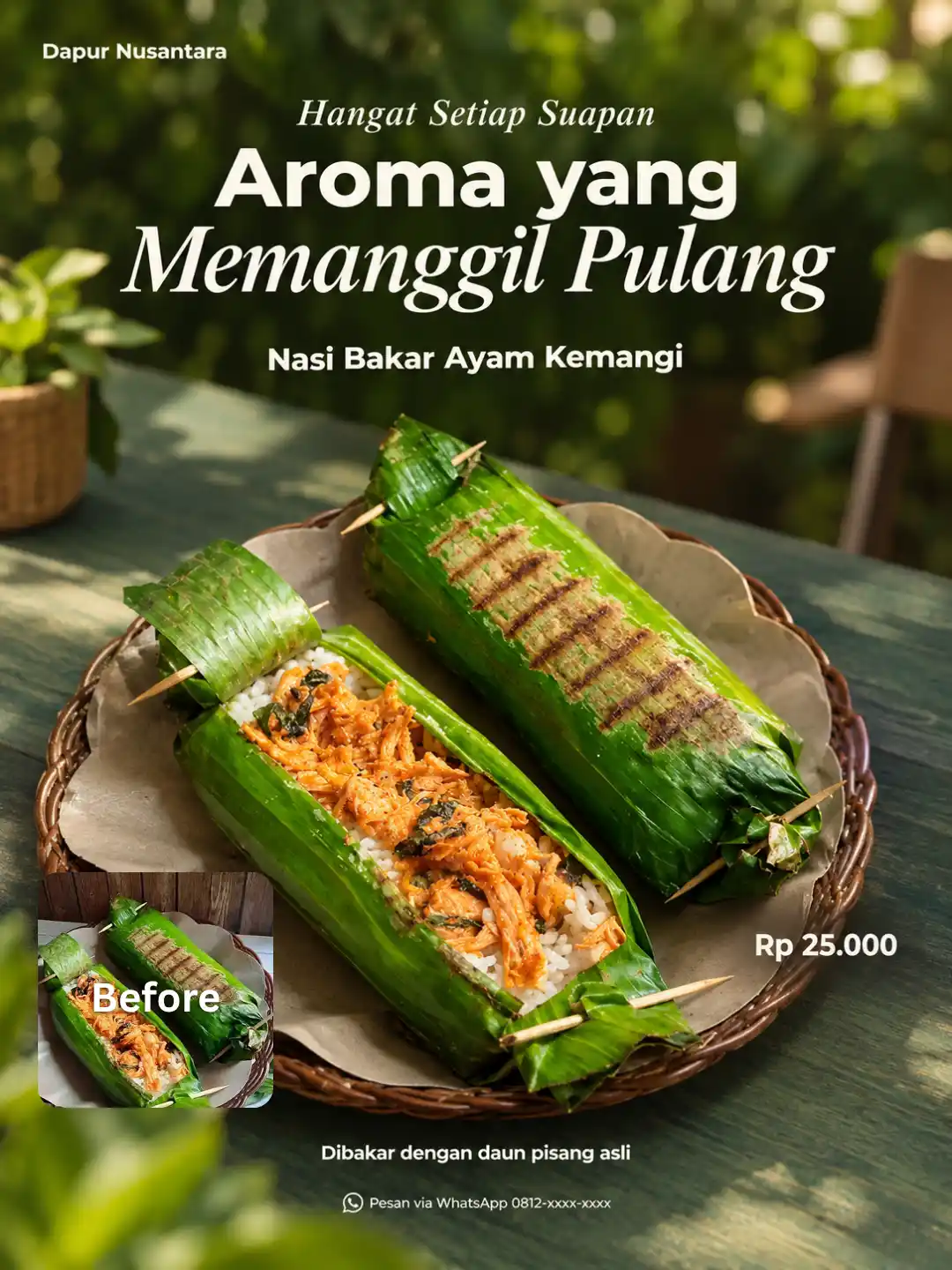
PRODUCT_NAME: Nasi Bakar Ayam Kemangi\
BRAND_NAME: Dapur Nusantara\
LOGO: none\
MAIN_HEADLINE: Aroma yang Memanggil Pulang\
ACCENT_PHRASE: Hangat Setiap Suapan\
SHORT_COPY: Dibakar dengan daun pisang asli\
PRICE: Rp 25.000\
CONTACT_ORDER: Pesan via WhatsApp 0812-xxxx-xxxx\
PRODUCT_CATEGORY: food\
TARGET_MOOD: warm and cozy\
\
═══════════ PART B: ROLE AND TASK ═══════════\
\
You are a senior commercial food and lifestyle photographer and art director.\
Create ONE premium editorial advertising photograph, 3:4 vertical (1080×1440 px), using the uploaded photo as the primary reference for the hero product.\
Priority order: (1) product fidelity, (2) text accuracy, (3) scene atmosphere.\
\
═══════════ PART C: PRODUCT ANALYSIS (do this silently before generating) ═══════════\
\
From the uploaded photo, identify and record:\
\- Product type and category (use PRODUCT_CATEGORY if provided, otherwise auto-detect)\
\- Silhouette, proportions, layers, toppings, ingredients, texture, dominant colors, portion size\
\- Serving vessel or packaging (shape, material, label, color)\
\- Dominant color family of the product (warm, cool, green, dark, light)\
\
Then apply these adaptation rules automatically:\
\
TABLETOP COLOR (garden green is the default concept):\
\- Product is warm-toned or light (brown, orange, cream, red, yellow): use deep forest green or muted emerald tabletop (#1F3D2B to #2F5D46).\
\- Product is green or herbal: use a darker olive-black green, or switch to warm cream, pale oak wood, or terracotta so the product separates clearly.\
\- Product is very dark (chocolate, black coffee, dark packaging): use a mid sage green or light oak tabletop for contrast.\
\- Product is white or pale: use deep emerald so the product glows against it.\
\
SERVING VESSEL:\
\- Keep the original vessel if it is clean, intact, and well framed.\
\- Replace it only if damaged, dirty, or poorly cropped. The replacement must suit the product (ceramic plate, glass, wooden board, or kraft tray) and be minimal and premium.\
\- Packaged products: keep packaging shape, label, and colors unchanged. Never redraw or alter packaging graphics.\
\
CAMERA ANGLE (choose by product shape):\
\- Tall items (drinks, cakes, burgers, stacked dishes): eye level to 15° above, 85mm look, f/2.8–f/3.5.\
\- Wide or flat items (rice dishes, pasta, pizza, bowls, salads): 35–45° above the table, 50mm look, f/3.5–f/4.\
\- Small items (pastries, cookies, snacks): 25–35° above, 85mm macro-feel, f/2.8.\
\
PROPS (max 2, only relevant to the product):\
\- Choose from: a leaf, matching cutlery, a glass of water, a folded linen napkin, or a small ingredient reference from the product itself (e.g., pandan leaf for pandan drinks, coffee beans for coffee).\
\- Never add ingredients that are not in the uploaded product.\
\
MOOD (follow TARGET_MOOD):\
\- fresh and natural: bright daylight, more visible greenery.\
\- warm and cozy: slightly warmer sunlight, softer shadows, still bright.\
\- modern and clean: minimal props, crisp shadows, calm background.\
\
═══════════ PART D: PRODUCT FIDELITY (highest priority) ═══════════\
\
The product must stay clearly recognizable as the exact same real product from the uploaded photo.\
Preserve: silhouette, proportions, all ingredients/toppings/layers, natural texture, true colors, realistic portion size, packaging identity.\
Allowed to improve: lighting, camera angle, plating neatness, serving vessel (only when needed).\
Forbidden: adding or removing ingredients, redesigning the product, simplifying it into a generic AI version, changing its color identity.\
\
═══════════ PART E: SCENE AND LIGHTING ═══════════\
\
A refined outdoor or semi-outdoor garden dining table with the tabletop color chosen in Part C. Matte surface with subtle natural texture, entering the frame diagonally at a slight perspective.\
Background: softly blurred lush foliage, optionally one blurred lifestyle element (seated person, chair back, or glassware). Moderate greenery, not overgrown. Keep the area around the product clean.\
Lighting: warm natural sunlight from one side, slightly above. Bright highlights on the product, soft-to-medium directional shadows, gentle rim separation from the background. Fresh, bright, elegant, realistic exposure. Not underexposed, not heavily cinematic, no strong yellow-orange cast.\
Depth: three layers: blurred foliage (back), tack-sharp hero product (middle), one subtle blurred foreground element that never covers the product. Slightly imperfect, natural styling without clutter.\
\
═══════════ PART F: COMPOSITION AND SAFE ZONES ═══════════\
\
Product in the lower-middle area, 40–50% of the frame, fully visible.\
Top 40%: calm, darker-toned negative space reserved for text.\
Bottom 12%: breathing room for supporting text.\
6% margin on all sides. No text touching or crossing the frame edges.\
\
═══════════ PART G: TYPOGRAPHY AND TEXT RULES ═══════════\
\
Fonts (only two families):\
\- Bold contemporary sans-serif (Montserrat Bold / Inter Bold style) for headline and supporting text\
\- Elegant high-contrast italic serif (Playfair Display Italic style) for accent words\
Text color: soft ivory (#F6F1E7) on dark areas; warm charcoal (#2B2B26) only on bright areas. If the tabletop was switched to a light color in Part C, use deep green-black (#1A2A1F) for all text.\
No outlines, glow, heavy shadows, stickers, badges, gradients, or decorative effects.\
\
TEXT RENDERING RULES:\
\- Render ONLY the values given in Part A. Each string appears exactly once, spelled exactly as written.\
\- If a field is empty, "none", or wrapped in [brackets], OMIT it completely. Never print placeholder words.\
\- Never invent extra copy, slogans, or labels. Never print the field names (e.g., "BRAND_NAME") in the image.\
\- If LOGO is provided, place it small and unchanged at top-left. Do not redraw it. If no logo, use BRAND_NAME as small text top-left.\
\
PLACEMENT:\
\- MAIN_HEADLINE: dominant, upper-center. 1–3 lines depending on length. Layered mix of bold sans-serif and italic serif. Longer headline = smaller size, so it never leaves the safe zone.\
\- ACCENT_PHRASE: small italic serif, above, below, or slightly overlapping the headline.\
\- PRODUCT_NAME: medium size, below the headline or just above the product.\
\- PRICE: compact, slightly bold, near the product.\
\- SHORT_COPY: small sans-serif, bottom area.\
\- CONTACT_ORDER: very small, bottom edge.\
Hierarchy: product (visual hero) → headline → product name → price → supporting text. Text must never cover the product.\
\
═══════════ PART H: NEGATIVE ═══════════\
\
Changed product identity, invented ingredients, extra or misspelled text, gibberish letters, printed placeholder text, watermarks, neon green, underexposed or muddy shadows, orange/yellow cast, plastic-looking plants, excessive foliage, cluttered table, distorted hands or faces, warped plates or glasses, floating objects, heavy foreground blur, tight crop, harsh HDR, oversmoothed fake-perfect look.@Create image
Salin prompt di atas.
Buka ChatGPT. Kalau punya foto produk atau foto model, lampirkan dulu.
Ganti bagian yang berwarna kuning dengan data usahamu, lalu kirim.
Pilih rasio 3:4 saat membuat gambar agar hasilnya sesuai.