

============ PART A: PRODUCT DATA INPUT (EDIT THIS ONLY) ============

[PRODUCT_URL: tempel link menu atau produk, or none]
[RATIO: 3:4 / 4:5 / 1:1 / 9:16]
[LAYOUT_VARIANT: pilih satu: 1 / 2 / 3 / 4]
[BASE_COLOR: warna dasar diambil dari warna produk, contoh: mustard yellow, tomato red, forest green, cream]
[SURFACE: wooden board / marble slab / plain paper surface / none]
[LIGHT_DIRECTION: hard sunlight from upper left / hard sunlight from upper right / soft window light]
[SUPPORT_ITEMS: maksimal 3 bahan yang memang ada di produk, contoh: arugula leaves, cherry tomatoes, sesame seeds, or none]

Text (use exactly as written, keep within the limits):
[MAIN_WORD: satu kata raksasa, maksimal 9 huruf, huruf kapital, contoh: BURGER]
[SCRIPT_WORD: satu kata tulisan tangan, maksimal 10 huruf, contoh: Veggie, or none]
[PRICE_TEXT: harga yang benar dan masih berlaku, contoh: Rp 35.000, or none]
[DELIVERY_LINE: contoh: Pesan antar via, or none]
[DELIVERY_PLATFORMS: leave space / none]
[HANDLE: akun media sosial, contoh: @namaakun, or none]
[LOGO: attached brand logo (official file only), or none]

PHOTOS TO ATTACH: PRODUCT_PHOTO (one clear, sharp photo of the dish or product, from the front or a slightly low angle, on any background), and optionally PRODUCT_PHOTO_2 (another angle).

LAYOUT_VARIANT options:
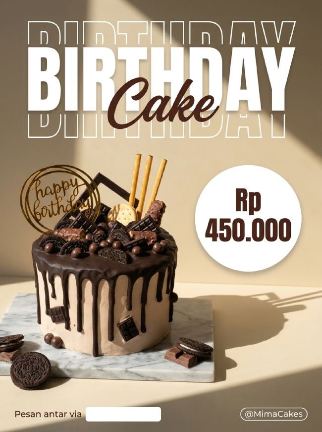
1 = Reference style: MAIN_WORD huge at the upper third with the outline echo above and below, SCRIPT_WORD overlapping it, PRICE_TEXT in a small white capsule at the lower right of the title, the product large on SURFACE in the lower two-thirds, a footer at the bottom.
2 = Close-up: a tighter, larger product filling the lower 70% of the frame, MAIN_WORD placed behind and partly overlapped by the top of the product, the outline echo only below the word, a footer at the bottom.
3 = Ingredients: the product centered on SURFACE with SUPPORT_ITEMS scattered naturally around it on the surface (never hiding the product), MAIN_WORD at the top with a single echo, a footer at the bottom.
4 = Price focus: the product on the left half at a three-quarter angle, a large round PRICE_TEXT badge at the right, MAIN_WORD stacked at the top, a footer at the bottom.

DATA RULES:
1. If PRODUCT_URL is given, open and read the page first and extract only the product name and the ingredients that are written there. Never guess ingredients, allergens, nutrition, or claims.
2. Use ONLY the text, price, and handle that I provide. Do NOT invent prices, discounts, promos, menu names, ingredients, or claims. Do not write "healthy", "low calorie", "halal", "organic", "vegan", "gluten-free", or any health or certification claim unless I wrote it myself. If a field is "none", leave that element out completely.
3. Do not create or imitate any delivery-platform or brand logo. If DELIVERY_PLATFORMS is "leave space", leave a clean empty rectangular area next to DELIVERY_LINE for me to place the official logos myself.
4. Before creating the image, show me all the text as a short list and wait for my "OK".

============ PART B: DESIGN STYLE (DO NOT CHANGE) ============

TASK: Design one bold, appetizing food advertisement poster, ratio RATIO. No people, no hands, no faces anywhere in the image. One hero dish, one giant word, one price capsule, one clean footer. Hierarchy: the dish first, MAIN_WORD second, price third, footer last.

STEP 0 (do this first): If no product photo is attached, stop and ask me to attach one. Do not invent a dish.

PRODUCT LOCK: Treat the attached photo as locked reference. Keep the exact shape, size, ingredients, layers, colors, toppings, sauce, texture, and every detail of the dish exactly as in the photo. Do not add, remove, or change any ingredient, and do not make portions bigger or neater than they are. Only lighting, angle, scale, placement, and the background may change. If the product is in a package, keep its label and every printed text and logo exactly as in the photo.

COLOR SYSTEM (restraint is mandatory):
- BASE_COLOR as one flat, matte, solid color field in two shades (a slightly darker shade on the wall, a slightly lighter shade on the floor), plus white, plus ONE deeper, warmer tint of the same hue for SCRIPT_WORD. The food's own colors are the only others.
- No gradients except the natural light falloff, no extra hues, no rainbow, no neon.

LIGHT AND PHOTOGRAPHY: photorealistic commercial food photography, ONE hard directional light (LIGHT_DIRECTION) that casts a clear diagonal shadow across the wall and a long soft-edged shadow beneath and beside the dish and SURFACE. High clarity, crisp textures, glossy highlights on sauces and glazes, visible detail on bread, leaves, seeds, and meat or plant protein. The dish looks fresh, juicy, and appetizing. No steam, smoke, or glow effects. No lens flares.

SURFACE AND PROPS: only SURFACE and the SUPPORT_ITEMS listed, all unbranded and realistic. No cutlery, no extra plates, no packaging unless it is in the photo, no text on any object.

TYPOGRAPHY:
- MAIN_WORD: huge, extra-bold, geometric sans-serif, uppercase, white, with an outline-only echo of the same word repeated above and below (one to three echoes, thin white lines, fading in opacity), centered or aligned to the left margin. The dish may overlap the lower edge slightly, but every letter must remain readable.
- SCRIPT_WORD: a flowing hand-written script in the deeper warm tint, placed so that it overlaps the upper edge of MAIN_WORD, large but readable.
- PRICE_TEXT: bold sans-serif, in a small rounded white capsule (text in the deep tone of BASE_COLOR), near the lower right of the title. In layout 4: a larger round badge.
- DELIVERY_LINE: a light sans-serif, white, small. HANDLE: a light sans-serif inside a thin white outlined capsule, bottom right.
- No other text. All text has strong contrast and is never placed over the busiest part of the dish.

LOGO: attached LOGO small in one corner. Skip if "none". Do not create fake logos.

COMPOSITION: one strong focal point, generous empty color field around the dish, margins at least 5% on every side, nothing important cropped by the frame edge, the dish sits on the lower two-thirds, the title in the upper third. Follow RATIO.

TEXT RULES: use ONLY the text I provide or approve. Spell every word, number, and symbol exactly as given, including the price format. Do not add slogans, extra prices, "NEW", "PROMO", floating words, fake brands, or pseudo-text. If text cannot be rendered correctly, make it smaller rather than invent letters.

QUALITY CHECK before finalizing: (1) the dish identical to the photo with no added or changed ingredients, (2) every word and number spelled exactly as provided, (3) MAIN_WORD readable despite the echo and overlap, (4) only the base color family, white, and one warm accent, plus the food's colors, (5) no people, hands, or faces, (6) one clear light direction with matching shadows, (7) the delivery logo space left empty and aligned. If any check fails, fix it and regenerate.

AVOID: people, hands, faces, AI-slop look, a changed or "improved" dish, invented ingredients, plastic-looking food, oily or fake gloss, melted or distorted shapes, garbled or invented text, fake or real delivery-platform logos drawn by AI, health or certification claims, clutter, extra props, multiple color themes, rainbow overload, steam or smoke, lens flares, fake HDR, watermark, low contrast, cartoon or 3D-render look.
Salin prompt di atas.
Buka ChatGPT. Kalau punya foto produk atau foto model, lampirkan dulu.
Ganti bagian yang berwarna kuning dengan data usahamu, lalu kirim.
Pilih rasio 4:5 saat membuat gambar agar hasilnya sesuai.